You’ve got the traffic. Your product’s solid. The design looks good.
So why aren’t users converting?
More often than not, the culprit isn’t your offer—it’s your user experience. Clunky navigation, friction-filled flows, or overlooked mobile details can quietly kill conversions before users even hit “Buy” or “Sign up.”
Let’s break down the 10 most common UX mistakes that could be draining your conversion potential—and how to fix them.
1. Slow Page Load Times
This one’s basic, but brutal. If your site takes longer than 3 seconds to load, you’re losing users. Period.
Fix it: Compress images, streamline your code, and prioritize performance. Google’s Core Web Vitals are your friend.
2. Confusing Navigation
If users can’t find what they need in a few clicks, they’ll bounce. Overly complex menus, hidden links, or inconsistent structure = frustration.
Fix it: Stick to intuitive, flat navigation. Keep menus clear and predictable.
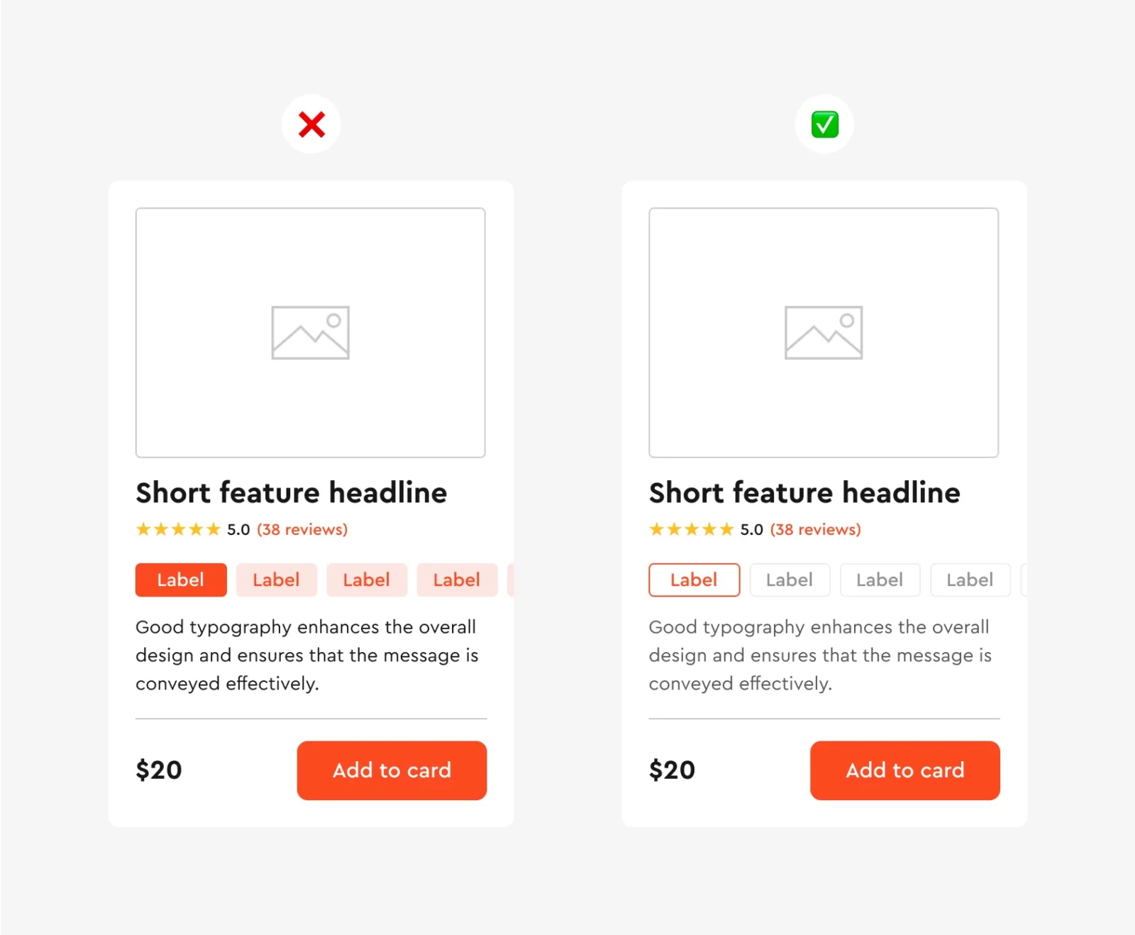
3. Lack of Visual Hierarchy
Users need visual cues to understand where to focus. If every button, header, or image competes for attention, your conversion message gets lost.
Fix it: Use size, color, and spacing to guide attention. Make CTAs stand out—don’t bury them.
4. Weak or Unclear CTAs
“Submit” or “Click Here” doesn’t cut it. Your calls-to-action should be clear, benefit-focused, and immediate.
Fix it: Use action verbs and tie your CTA to value. Try: “Get My Free Trial” or “Start Saving Now.”
5. Too Many Form Fields
Long, intimidating forms are one of the fastest ways to kill conversions. Unless you really need every detail, keep it short and sweet.
Fix it: Only ask for essential info. Use autofill and smart defaults to reduce effort.
6. Not Optimizing for Mobile
Mobile-first isn’t optional anymore—it’s standard. If your UX breaks on small screens, you’re bleeding potential customers.
Fix it: Design responsively. Test on multiple devices. Pay attention to tap targets, load speed, and thumb-friendly UI.
7. Ignoring Microcopy
That tiny text next to a form field or under a button? It matters. Poor or missing microcopy can create hesitation or confusion.
Fix it: Add helpful hints, remove jargon, and write with clarity and warmth.
8. No Trust Signals
Users don’t convert if they don’t trust you. Missing testimonials, security badges, or social proof makes your offer feel risky.
Fix it: Show reviews, display partner logos, and make privacy/security obvious (especially on checkout pages).
9. Annoying Pop-Ups or Overlays
Pop-ups that hit users the second they land? Exit-intent traps? Hard pass. Intrusive elements kill momentum.
Fix it: Be strategic. Use pop-ups sparingly and time them to add value—not interrupt.
10. Lack of Feedback on User Actions
Ever clicked a button and wondered, “Did that work?” That silence leads to doubt—and drop-offs.
Fix it: Always show visual feedback—loading states, confirmations, success animations—so users feel in control.
Final Thoughts
Great UX doesn’t just make things look good—it builds trust, reduces friction, and guides users to take action.
If you’re not seeing the conversions you want, step back and ask:
Is my experience helping users succeed—or getting in their way?
Fix these 10 common mistakes, and you’ll turn more visitors into customers—without spending a dollar on extra traffic.