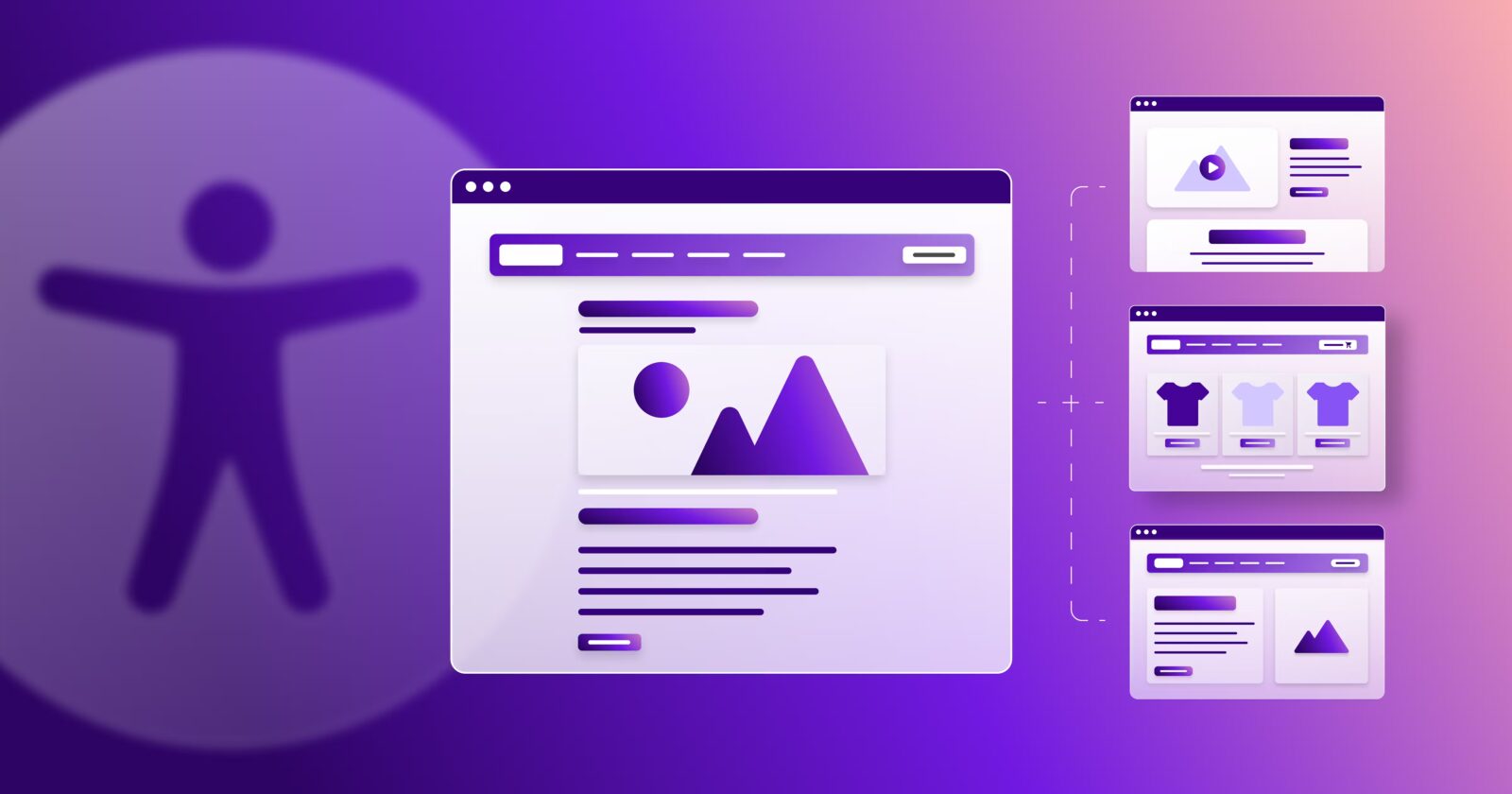
Accessibility isn’t just a “nice-to-have”—it’s a non-negotiable in modern UX design.
In 2025, with digital experiences woven into almost every aspect of life, creating inclusive, accessible interfaces is both a responsibility and a competitive advantage. The good news? Building accessible products doesn’t have to be complex—it starts with a few foundational principles.
Here are the Golden Rules of Accessibility in UX Design that every team should live by:
1. Design for Everyone, Not the Average
The idea of a “typical” user doesn’t exist. Your audience includes people with different abilities, devices, environments, and experiences.
What it means:
Don’t design for the perfect scenario. Think about users who rely on screen readers, navigate with keyboards, or use voice commands. Inclusive design benefits everyone—not just those with disabilities.
2. Color Is Not the Only Way
Color can enhance UX, but it should never be the sole method of conveying information. Relying on color alone alienates users with visual impairments or color blindness.
What to do:
Use text labels, patterns, icons, or contrast indicators alongside color to communicate status or function (e.g., success, error, progress).
3. Maintain Sufficient Contrast
Poor contrast = unreadable content. If users have to squint or zoom just to read your interface, your design is broken.
Golden ratio:
Aim for a contrast ratio of at least 4.5:1 for body text and 3:1 for larger headers. Tools like WebAIM’s Contrast Checker are your best friend.
4. Keyboard Navigation Matters
Some users can’t (or don’t) use a mouse. That means every interactive element—links, buttons, menus—must be accessible via keyboard alone.
What to check:
Can users tab through your interface in a logical order? Are focus states visible and easy to follow? If not, you’re creating friction for a huge group of users.
5. Use Semantic HTML and ARIA Responsibly
Screen readers rely on structured, semantic markup to understand your content. Misusing <div>s or overusing ARIA roles can create confusion instead of clarity.
Best practice:
Use semantic tags (<nav>, <button>, <form>, etc.) whenever possible. Only use ARIA roles when there’s no native HTML element for the job.
6. Provide Text Alternatives for Media
Images, videos, and icons must have accessible text equivalents so that screen readers and assistive tools can convey their meaning.
How to do it:
- Use
alttext for images (keep it concise and meaningful) - Include captions and transcripts for audio/video content
- Label icons with
aria-labelor screen reader-friendly markup
7. Give Users Control
Flashy animations or auto-playing media might look cool, but they can be overwhelming, distracting, or even trigger health issues.
What to implement:
- Let users pause or disable motion and audio
- Respect system preferences like “prefers-reduced-motion”
- Avoid content that shifts or moves unpredictably
8. Test with Real People
Automated checkers are useful, but real accessibility comes from real-world testing. Include users with disabilities in your research and testing cycles.
Pro tip:
Use screen readers (like NVDA or VoiceOver), test with keyboard only, and simulate different impairments to spot issues early.
Final Thoughts
Accessible design isn’t just about compliance—it’s about respect, empathy, and universal usability.
When you build with accessibility in mind, you’re not just ticking boxes. You’re creating experiences that reach more people, serve more needs, and reflect the true diversity of your audience.
So the next time you design a button, layout, or flow, ask yourself:
Can everyone use this easily and with dignity?
That’s the real golden rule.