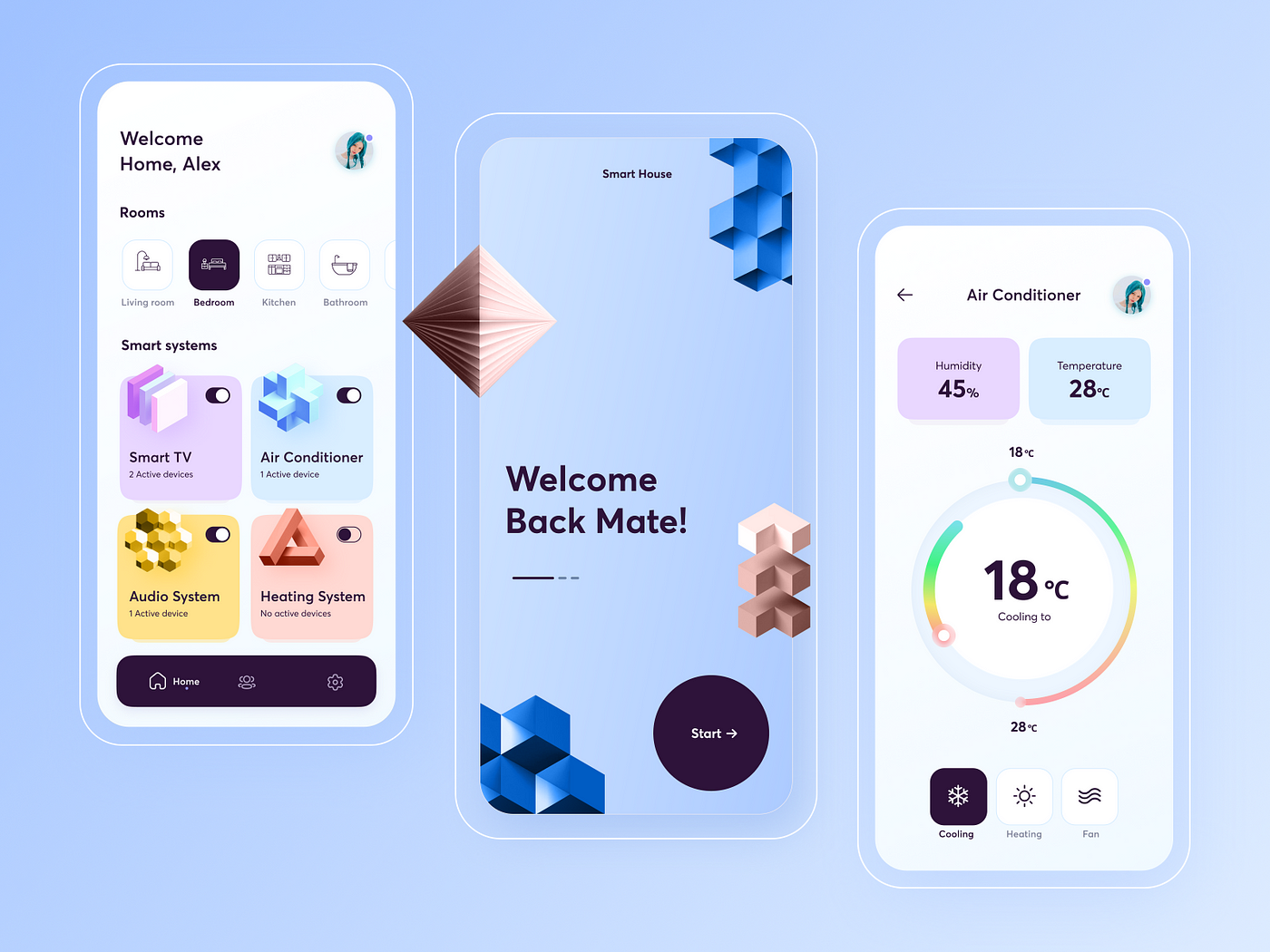
With over half of web traffic coming from mobile devices, designing great mobile UIs isn’t optional—it’s mission-critical. Users expect fast, intuitive, and elegant mobile experiences, and anything less sends them straight to the “uninstall” or “back” button.
Whether you’re building an app from scratch or optimizing a responsive site, these mobile UI design best practices will help you craft interfaces that feel modern, fluid, and user-friendly—on any screen size.
1. Design for Thumbs, Not Cursors
On mobile, your UI needs to work within the range of human thumbs—not the precision of a mouse.
Tips:
- Place primary actions (like “Next” or “Add to Cart”) within easy reach—typically the lower half of the screen.
- Use large, tappable targets (at least 44x44px) to prevent accidental taps.
- Avoid placing key buttons in corners where thumbs can’t comfortably reach.
📱 Thumb-friendly design = happier users.
2. Keep It Clean and Minimal
Less is more—especially on a small screen. Cluttered layouts confuse users and slow them down.
Do:
- Prioritize content and actions users need most.
- Collapse or hide secondary elements (use bottom sheets, tabs, or drawers).
- Use whitespace strategically to improve focus and flow.
🔍 A clear interface is a fast interface.
3. Prioritize Performance and Load Time
Even the most beautiful design fails if it’s slow or unresponsive. Mobile users are impatient—and for good reason.
Best practices:
- Optimize image sizes and compress assets.
- Avoid unnecessary animations that block interaction.
- Test on real devices, not just emulators.
⚡ A fast UI is a usable UI.
4. Use Platform-Specific UI Patterns
iOS and Android users have different expectations. Don’t fight the platform—lean into its conventions.
For iOS:
- Use tab bars for navigation.
- Stick with native controls like sliders, date pickers, and action sheets.
For Android:
- Use Material Design components.
- Embrace the floating action button (FAB) for primary actions.
🎯 Consistency builds trust and reduces learning curves.
5. Design for One-Handed Use
Your users are often multitasking—commuting, holding coffee, wrangling kids. Design your UI for single-hand interaction.
Tips:
- Group essential controls at the bottom.
- Avoid placing key elements at the top or requiring stretching.
- Let users swipe, tap, and scroll naturally—no acrobatics required.
✋ If it requires two hands, it’s not truly mobile-friendly.
6. Simplify Forms and Input
Forms are often painful on mobile—but they don’t have to be.
Best practices:
- Minimize required fields.
- Use appropriate input types (e.g.,
telfor phone numbers). - Auto-fill where possible, and break long forms into steps.
💡 Microcopy and inline validation also help prevent frustration.
7. Provide Visual Feedback for Every Interaction
Users need to know their actions are being recognized.
Examples:
- Show a spinner or progress bar during loading.
- Animate button taps or transitions subtly.
- Confirm form submissions with a success message or toast.
🙌 Feedback = clarity = confidence.
8. Dark Mode Support
It’s not just a trend anymore—dark mode is an expected feature for many mobile apps.
Why it matters:
- Reduces eye strain in low light
- Saves battery on OLED screens
- Gives users more control over their experience
🌙 If your app doesn’t support dark mode yet, it’s time to add it.
Final Thoughts
Designing for mobile is more than shrinking a desktop UI—it’s rethinking the experience from the ground up.
By focusing on thumb-friendly layouts, clarity, performance, and platform conventions, you create a mobile UI that feels effortless and polished.
Because in the end, great mobile design isn’t about showing off—it’s about getting out of the way so users can do what they came to do, fast.

