Not long ago, dark mode felt like a novelty. A slick toggle in your phone’s settings, a trendy feature designers used to flex their UI chops. But fast forward to 2025, and the question isn’t “Should we support dark mode?”—it’s “Why isn’t this your default?”
So is dark mode still just a trend—or has it become the new design standard? Let’s dive in.
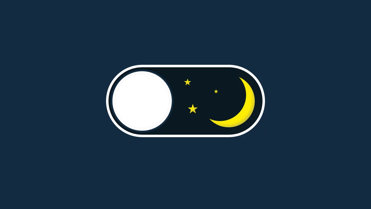
Why Dark Mode Took Off
Dark mode’s rise was fueled by a perfect storm of usability, aesthetics, and energy efficiency:
- Reduced eye strain: Especially in low-light environments.
- Battery saving: OLED and AMOLED screens conserve power with darker pixels.
- Sleek aesthetics: It just looks modern—moody, elegant, and easy on the eyes.
By the time Apple, Google, and major platforms like Twitter and YouTube adopted system-wide dark modes, user expectations shifted. Now, people want their tools to match their environment—and their preferences.
2025: From Optional to Default
In 2025, dark mode has matured. It’s no longer just a UI bonus—it’s becoming a default experience, especially for mobile apps, developer tools, media platforms, and even enterprise software.
Key signs of its evolution:
- Dark-first design: Some brands now start with dark mode as the primary experience.
- Context-aware theming: Interfaces shift based on time of day, ambient light, or device settings.
- Deeper accessibility: Designers are putting more thought into contrast ratios, color psychology, and how dark UI affects users with visual sensitivities.
Rather than just inverting colors, teams are now designing natively for dark mode—custom shadows, glow effects, muted palettes, and crisp typography that make dark interfaces feel intentional, not afterthought.
But It’s Not One-Size-Fits-All
Despite its popularity, dark mode isn’t universally better. Poorly implemented dark UIs can:
- Reduce readability when contrast isn’t handled right
- Fatigue users over long sessions if the palette is too harsh
- Feel disconnected from brand tone if not thoughtfully designed
That’s why smart design teams are leaning into adaptive design—not just offering light and dark, but ensuring both are crafted with the same care and clarity.
So, Trend or New Standard?
It’s both. Dark mode started as a trend, but it’s grown into a foundational part of modern UI/UX design.
In 2025, the real standard isn’t just dark mode—it’s user-controlled, context-aware theming. Users expect flexibility. They want interfaces that respect their preferences, environments, and moods.
Final Thoughts
Dark mode isn’t going anywhere—it’s just evolving. What started as an aesthetic choice has become a pillar of user-centered design. And in a world where personalization is key, giving users visual comfort and control is no longer optional.
So whether you’re redesigning your app or building something brand new, don’t ask if you should support dark mode.
Ask:
How can we make it exceptional?