When we think of UX, we usually picture layouts, buttons, flows, and interactions. But what about the words?
From the label on a button to the error message that appears at the worst possible time, UX writing is the invisible thread that connects design to clarity—and users to outcomes. Done right, it makes your product feel helpful, human, and intuitive. Done wrong? It confuses, frustrates, and drives users away.
Here’s why UX writing matters—and how those small strings of text are shaping the entire user experience.
What Is UX Writing, Exactly?
UX writing is the craft of creating clear, concise, and useful language across digital products. Think of:
- Button labels
- Navigation menus
- Form instructions
- Error messages
- Onboarding screens
- Empty states
- Confirmation modals
Basically, anything that guides the user, sets expectations, or explains what’s happening—that’s UX writing in action.
Why UX Writing Matters
1. It Builds Trust
Good UX writing reduces uncertainty. When users know what will happen before they click, they feel confident and in control.
Example:
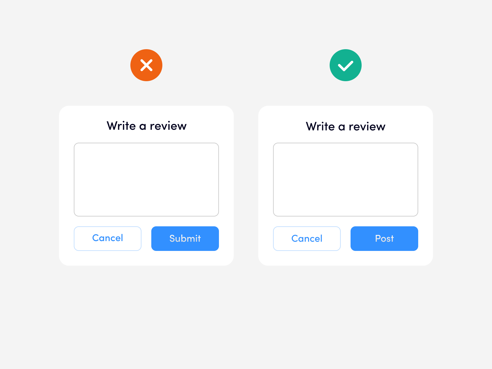
Instead of a vague “Submit,” say “Send my application.” It’s specific, action-oriented, and trustworthy.
2. It Reduces Cognitive Load
Clear copy keeps users moving. Confusing or wordy instructions slow them down—or worse, make them quit.
Pro tip:
Use plain language. Aim for simplicity without dumbing things down.
3. It Humanizes the Product
UX writing gives your product a voice. Whether your tone is playful, professional, or empathetic, consistent microcopy builds a relationship with users.
Example:
Error message:
🚫 “Oops! Something went wrong.”
vs.
✅ “We couldn’t save your changes. Please check your connection and try again.”
One is cute; the other is helpful.
Key Principles of Great UX Writing
✍️ Be Clear, Not Clever
Your user isn’t here to be impressed—they’re here to accomplish something. Prioritize clarity over wordplay.
⏱️ Write for Speed
People don’t read—they scan. Use short sentences, front-load important words, and keep CTAs snappy.
👂 Match the Tone to the Moment
Playful can work in onboarding. But during error messages or payment screens, users want reassurance and clarity—not jokes.
🧭 Guide, Don’t Just Inform
UX writing isn’t just about labeling—it’s about nudging users in the right direction. Help them make decisions and complete tasks without second-guessing.
Real-World Wins from Better UX Writing
- Dropbox simplified their onboarding language and saw higher completion rates.
- Slack uses warm, friendly copy to reduce friction and make their product feel more human.
- Airbnb refined their search filters with clearer labels, improving booking flow and reducing drop-off.
These wins don’t come from redesigning the UI—they come from rewording it.
Final Thoughts
Design is how it works. UX writing is how it speaks.
If your visuals are saying one thing but your words say another, users notice—and often, they leave.
So whether you’re designing a new feature or refining an old one, take a closer look at the copy. Because in the end, words are just as important as wireframes.


